Creating a memorable brand identity goes beyond logo design – it’s also about how you present that logo. Whether you’re in the early stages of building your business or looking to revamp your ageing corporate identity, using the correct format for your logo is an important step in promoting and protecting your company’s new branding. In offering up ways to help bring greater clarity when designing digital assets and defining design guidelines for different types of marketing materials, we’ll discuss which file formats are needed for each type of usage and why print pieces often require different versions than online assets.
Differences Between Vector and Raster Logos
Vector and raster are two forms of digital images that are used by graphic designers, printers, web developers and other creative professionals, but what are the differences between them and why should you care? Understanding these differences is key in creating quality visuals with the required outcomes, and the wrong choice can cause issues when trying to implement your brand digitally, or in printed material and signage.
What Are Raster Images?
When it comes to digital images, there are two main categories: raster and vector. Raster images, also known as bitmap images, are made up of pixels arranged in a grid pattern. Each pixel holds a specific colour value and, when viewed together, they create a cohesive image. The level of detail in a raster image is determined by the number of pixels or dots per inch (dpi). The higher the dpi, the better the image quality. Common raster image file types include JPEG, PNG, and GIF. While raster images are great for capturing photographs and other rich, detailed images, they can lose quality when resized or enlarged.
The loss of quality when resized makes raster images a bad choice for logos, as it will limit the size at which the logo can be reproduced, if the logo is created at 800px wide for example that will be the maximum width it could ever be used at. This can cause problems digitally, for example, a presentation or PDF document may need the logo at higher resolutions, but the real issue is printed material. With an A4 page being roughly 2480 x 3508 pixels, you can see how a logo created smaller than this would quickly cause issues, this does not take into account larger sized items, posters, banners, or other larger applications of your logo.
You might think the solution is to have the logo created at a huge resolution to avoid this, but this causes its own issues. The first is such a large resolution would make the logo file size overly large, making it more difficult to send files via email; the second is resizing raster images down also results in a loss of quality. The loss of quality is not as pronounced as when you try to increase the size of a raster image, but it’s still noticeable. Raster images work best when they are exactly the size they need to be.
What Are Vector Images?
In the world of design, vector images are essential. These images are created through mathematical equations, which allows them to be scaled to any size without losing their quality. Unlike raster images, which are made up of tiny dots or pixels, vector graphics consist of points, lines, and curves that can be edited and manipulated to create various shapes and forms. Because of their scalability, vector images are commonly used in logos, icons, and illustrations. They also typically take up less file space than raster images, making them more efficient for websites and digital media.
With their flexibility and versatility, vector images are the standard for professionally designed logos.

How Does This Impact Your Logo?
There will be situations where you need a vector image and others where a raster image would work better – for example, social media will use raster images, but anything print related should be using vector images.
The good news is if you have a vector logo you can use this as a master to create as many different-sized raster images as you need to. The bad news is if you only have a raster version of your logo you can’t convert it to vector – you will need to recreate it with the help of a competent designer. This is why it’s so important to get your logo created in the right format from the start, it’s cheaper in the long run as you won’t need to rework things down the line, just to make sure that it all matches.
Logo/Image File Formats
The Raster and vector titles describe the type of image, but how these are saved varies depending on the use and the program used. These are called file formats and work in the same way as other types of files for example .doc/.docx for Word documents and .ppt/.pptx for PowerPoint presentations. If you don’t have the logo in the right file format from the start, you might lose the flexibility & scalability of the vector or create an overly large file that is not usable.
With your logo you should always keep a master vector of the logo safe. This should then be used to create all your artwork, ensuring the highest quality source and therefore result.
When we design a new logo, we always provide it packaged in various formats, to ensure you have the original source file, as well as in the more commonly used formats such as JPG, PNG and SVG.
Raster File Formats
JPG
JPG files (.jpg) are designed to be used for photographic images, they are widely supported and one of the most common image file formats you are likely to encounter. Their global compatibility means they are used by a wide range of services from social media platforms, emails, and websites.
They are ‘lossy compressed’ which means there is a small amount of data loss from the original image each time they are saved. This makes it important to keep the original source image as a master instead of constantly resaving the same image.
For your logo, JPG is a good format to use on social media, email footers and other digital material that needs compatible images above anything else. For websites and similar, an SVG vector image will give far higher quality for a fraction of the file size.
This video, while an extreme example, showcases the issues with lossless images (What happens when you re-save a JPG 500 times):
TIFF
TIFF files (.tif/.tiff) are used for photographic images in the same way JPG files are. TIFF files however are lossless, which means they don’t lose quality when saved, so are much higher quality options for saving photos but offer no real benefits for your logo.
PNG
PNG (.png) files are lossless which makes them a good format for storing digital images such as logos or illustrations when they need to be rasterised, the key benefit they also have over JPG is the ability to have transparent backgrounds. This means they can be used without a solid white background in programs such as PowerPoint leaving you with a higher-quality finish. PNG files are widely supported and useful on social media platforms for their high quality, rather than JPG images.
GIF
GIF (.gif) files have their uses and, although it’s an older format, it does offer transparent backgrounds like PNG. However, GIF files are much lower quality than PNG. The benefit a GIF has over a PNG is the ability to add animation. This is useful in situations such as in emailers (for supported clients) but otherwise PNG would typically be a better format.
Vector File Formats
Vector file formats are not as widely supported as raster formats but are becoming more widely used to make use of their superior quality. Some of these formats are unlikely to open on your device without specialist design software. You must save all the source images your designer provides as they will be needed by other designers or printers when creating marketing materials.
SVG
SVG (.svg) files are quickly becoming the standard for logos online. They let you add your logo as a vector to your website which is compatible with modern browsers. This is an important development because it lets your logo scale to the device size alongside the rest of the website without losing any quality. SVG files are typically small in file size and load quickly vs traditional JPG/PNG file formats, something that is increasingly important with the shift of the web to mobile.
AI
AI (.ai) files are ‘Adobe Illustrator’ files, the standard for graphic design and likely to be the format that your logo was created in by any designer. This is the ‘raw’ original copy of your logo and should be saved for future use but is unlikely to be compatible with most devices/software and, as such, we would suggest sending them alongside another more friendly format.
AI files are the working file for your logo, this means that even if you can’t open it you should have a copy saved securely so that if you need a tweak/change making in the future, it can be made to the master file correctly, for a more consistent professional result.
As a master file AI can be used to create any of the other formats as needed.
EPS
EPS (.eps) files are encapsulated postscript. It’s an older file format that has been mostly replaced by AI files, but if your logo is older, you may have it in this format, and it should be treated as an AI file. It would be a good idea to have it converted across to an AI file & SVG file to ensure future compatibility with design software, but because they have been so widely used in the past, EPS files are likely to remain compatible for quite some time and this is simply a sensible precaution.
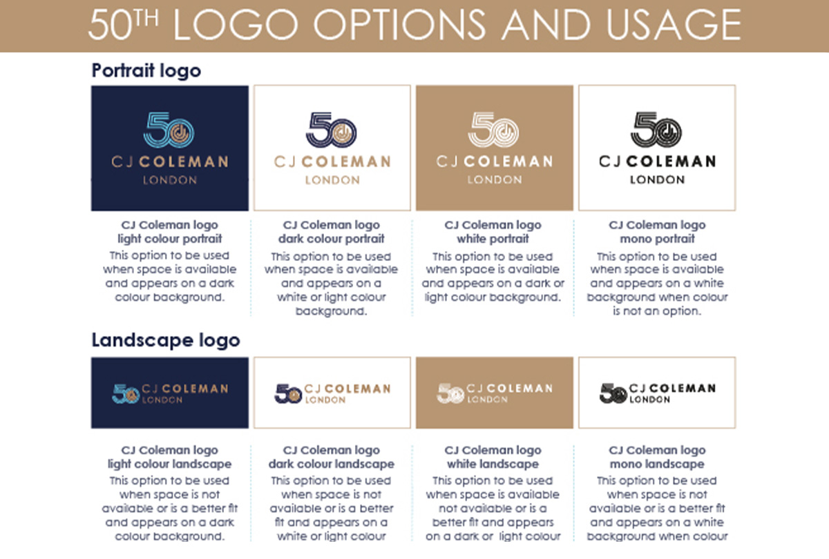
Logo Colour Prefix
Colour prefix is an important consideration when you are creating a logo in vector format, it’s important to think about when your logo is going to be used. For example, if you plan on using it for print then the CMYK colour prefix would be most suitable, for web RGB would be more appropriate. Your brand guidelines may outline your brand colours in several formats to ensure better consistency across print & digital formats.
It’s worth ensuring that your designer understands what prefix you need the logo to be created in, it’s a good idea to provide them with any Pantone colours you are trying to achieve & your intended use for the logo. Your designer can then create a colour palette and prefix that best suits how it will be used.
Regardless of what format your logo is in it’s important to keep all of your source files safe & backed up, which makes it easier to use the logo across different platforms in the future, and keeps the quality consistent.
RGB/HEX
RGB and HEX are two colour models commonly used in digital design. RGB stands for Red, Green, and Blue, and it is an additive colour model in which colours are created by adding light together. On the other hand, HEX stands for Hexadecimal, and it is a coding system used to represent colours in web design. HEX codes are comprised of six alphanumeric characters, and they specify the amount of red, green, and blue in a particular colour. Both RGB and HEX are widely used by designers and developers to create stunning visuals across various media platforms.
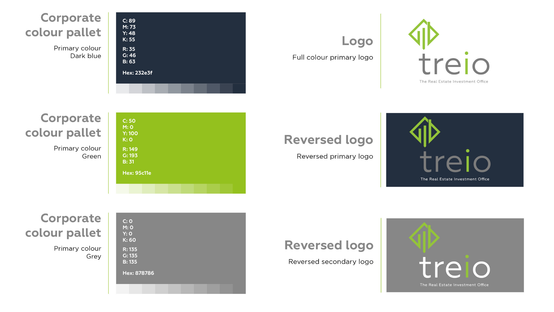
Pantone
Pantone is a standardised system used for colour matching across a variety of industries, including graphic design, fashion, and home decor. Pantone colours are identified by a specific number and are consistently reproduced across materials and mediums, ensuring that the intended colour is achieved every time. With Pantone’s extensive library of colours, designers and printers have a vast range of options to choose from, making it easier to create a standardised look for all your printed material.
CMYK
When it comes to printing, the colours that you see on your computer screen are not always the same as those that come out of a printer. This is where CMYK comes into play. CMYK stands for Cyan, Magenta, Yellow, and Key (Black) – these are the primary colours used in printing. Unlike RGB (Red, Green, Blue) which is used in digital displays, CMYK creates colour by mixing these pigments together. By layering these four colours in different amounts, printers can create a wide variety of hues and shades.
RAL
RAL is a colour-matching system that is widely used to standardise colours across different industries and applications, with each colour assigned a unique code for easy reference. From paint to plastic and even metallic finishes, RAL has become a go-to system for ensuring colour consistency, accuracy, and quality. Particularly useful for property signage or exterior facing signs/shop fronts, because colours can be matched to materials such as Perspex, powder-coated metal, paints plastics and coatings.
Summary
The creation of a logo, its file format and colour prefix, obviously requires some knowledge of the intended use. The colour prefix used for the logo depends on the medium it will be used on. For print, the CMYK colour prefix is most effective while RGB is best for web use. Additionally, brand guidelines may highlight colour codes in multiple formats to maintain consistency. The end uses will also impact the file formats required but by using a vector format we can convert logos to a wide range of formats without losing any quality. It is essential to communicate the intended use thoroughly to the designer to achieve the best results.


