
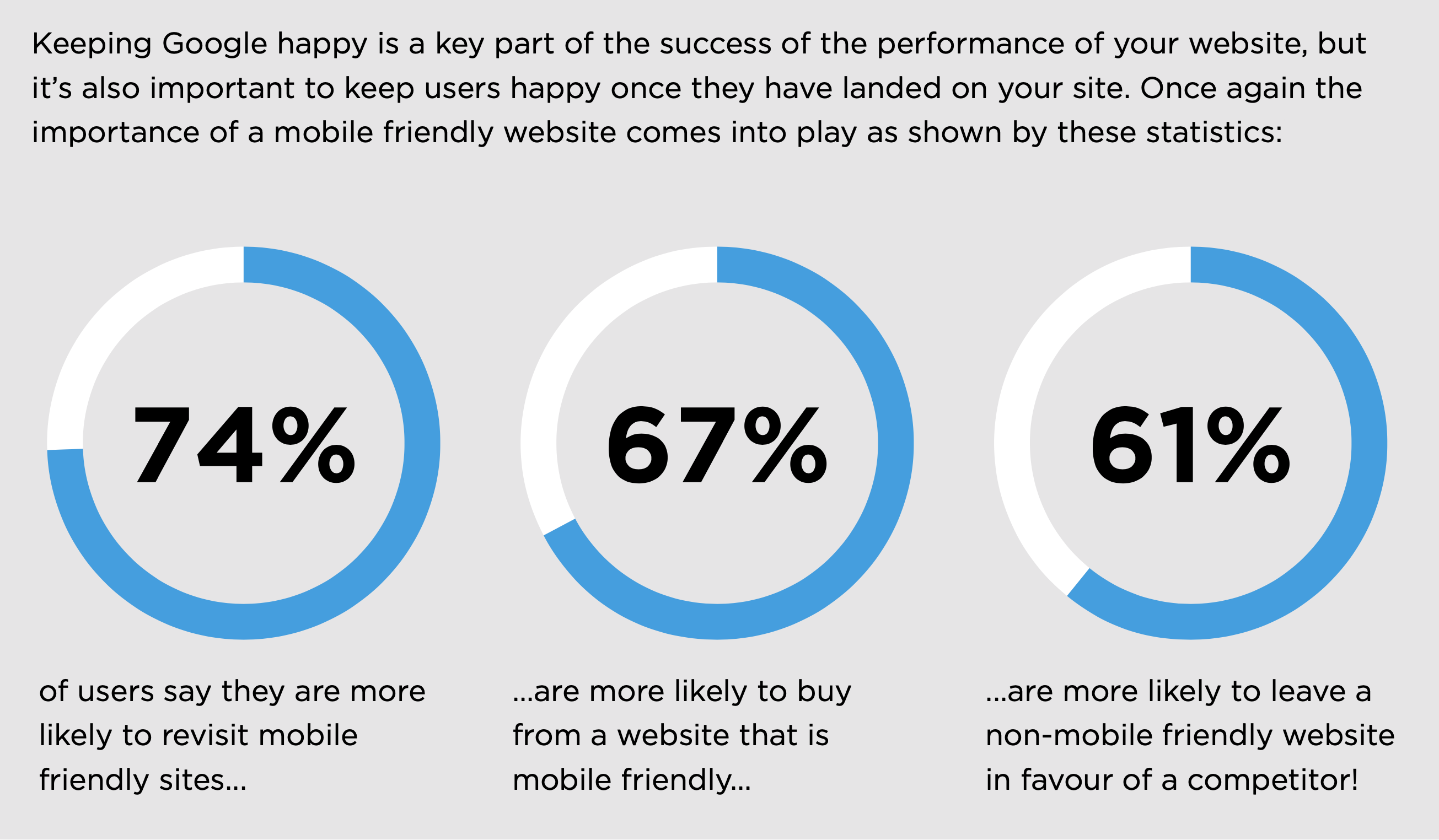
Worldwide mobile users now make up over 50% of visitors to websites, this varies between different industries, but it shows it’s now more important than ever that your website is catering to mobile visitors and not just the traditional desktop users.
The importance of this shift in focus is also highlighted by Google who has implemented a ‘Mobile-first Indexing’ strategy, this means that Google will view the mobile version of your website to determine what ranking it will have in the search results! This switch has been rolled out gradually, most sites are currently using this now, but by the end of this year, all websites will be indexed in this way.
So, what is a mobile friendly/responsive website?
Now we have looked at some of the reasons it’s important to have a mobile friendly website, we next need to look at what makes a website mobile friendly. Mobile users include visitors on a wide range of devices, from smartphones to tablets the number of different devices is staggering. The important thing they have in common is they are smaller, more ‘mobile’ devices, which means they have smaller screens than the desktops and laptops we might be used to.
This smaller screen is the key issue with mobile users viewing traditional websites. Essentially the screen is not large enough to view a standard website and leads to poor user experience. Some end up only viewing a small portion of the website at a time, meaning they miss key information, other devices zoom out to show the entire page but makes it difficult to read leading to users having to zoom in and out constantly.
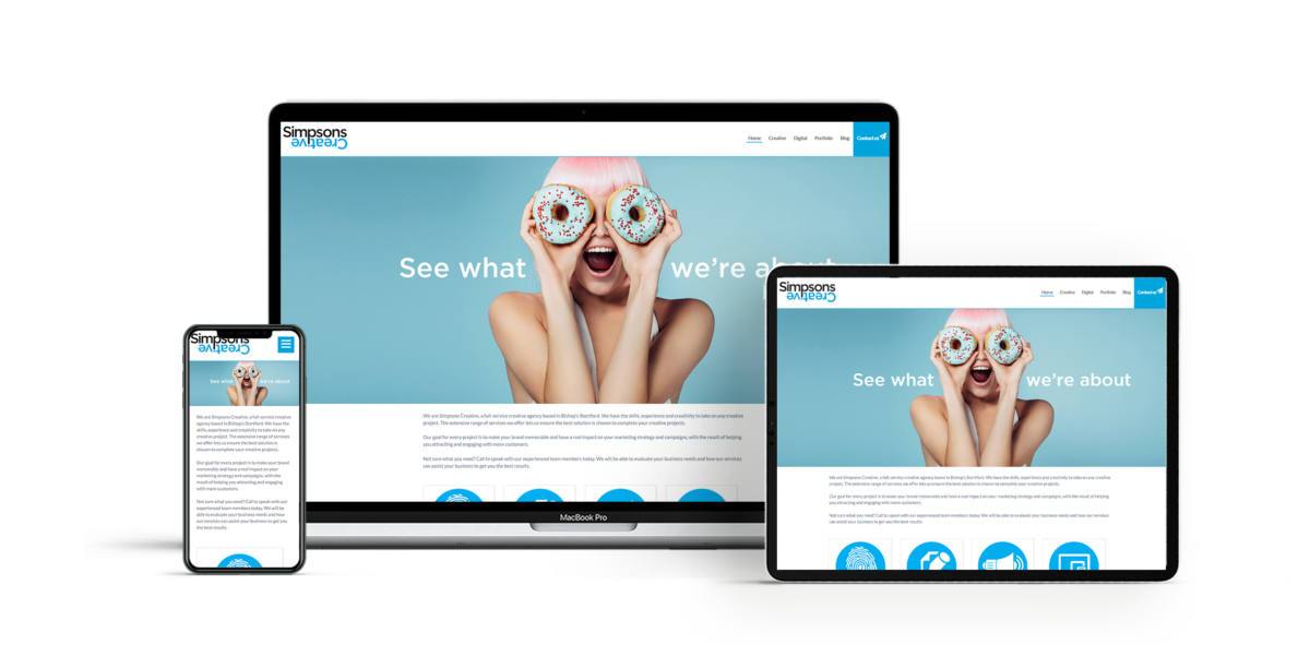
A mobile friendly website identifies when a mobile user is viewing the site and will automatically adapt the content on the screen to fit the device – this means that the users get the best possible viewing experience no matter which device they are using.
It can be as simple as changing the size of some elements such as images, to a more fundamental reworking of the layout but the result is an experience tailored to the screen size of the end-user.
Responsive websites take this a step further by looking at the resolution of the device and automatically adapt to this. This means they offer the ability to respond to changes in the size of the window and continuously adapt the content, ensuring it is being displayed in its best possible format. The big benefit here is that as new devices with larger or different screen sizes are released, on an almost annual basis, a responsive website will already be optimised for these devices, future-proofing the website from the start.
Another benefit of a responsive website can be lower running costs. This is because one solution meets all of your users’ needs – in the past, some websites deployed separate mobile-only websites to improve their experience, while this worked it also resulted in two separate websites that needed to be maintained and kept updated.
Keeping all of your users on a single responsive website also gives them a seamless user experience, this helps to build user confidence and enables them to view your website across all of their devices. They may start on mobile but take their browsing over to a desktop device for some activities such as contacting you or purchasing.
What do I need to check on my website?
The important bit here is to see if your website is mobile friendly or not, Google has a free tool that you can use to test your website: search.google.com/test/mobile-friendly
This will let you easily check how Google is viewing your website, the next step is to see if your website is fully responsive you can do this by viewing it in your browser and resize the window to see if it adapts in real-time. responsivedesignchecker.com is an online tool that will let you view your site on a range of popular devices to see how it displays.
If you’re in any doubt let us know and we can review your website for you.
If your website is not mobile friendly or responsive it’s more important than ever to tackle this issue.

Website Health Check Guide
This is part of our Website Health Check guide, the full version with all 10 sections is available to download for free now.
Download FREE Guide

