What goes into creating a logo?
Creating a logo is more than just slapping together a name and an image. A logo is often the first thing people will see when they are introduced to a new company or product, so it must make a good impression.
There are many factors to consider when designing a logo. The first is the company or product name. The name will be the foundation of the logo, so it must be clear and easy to read. The logo should also be recognisable and memorable. A good logo will be simple and easy to reproduce.
It’s also important to consider the company’s colours and branding when designing a logo. The logo should be easy to read and recognisable even when it is printed in black and white. The logo should also be compatible with the company’s existing colour scheme.
Finally, the logo must be scalable. It should look just as good on a business card as it does on a billboard.
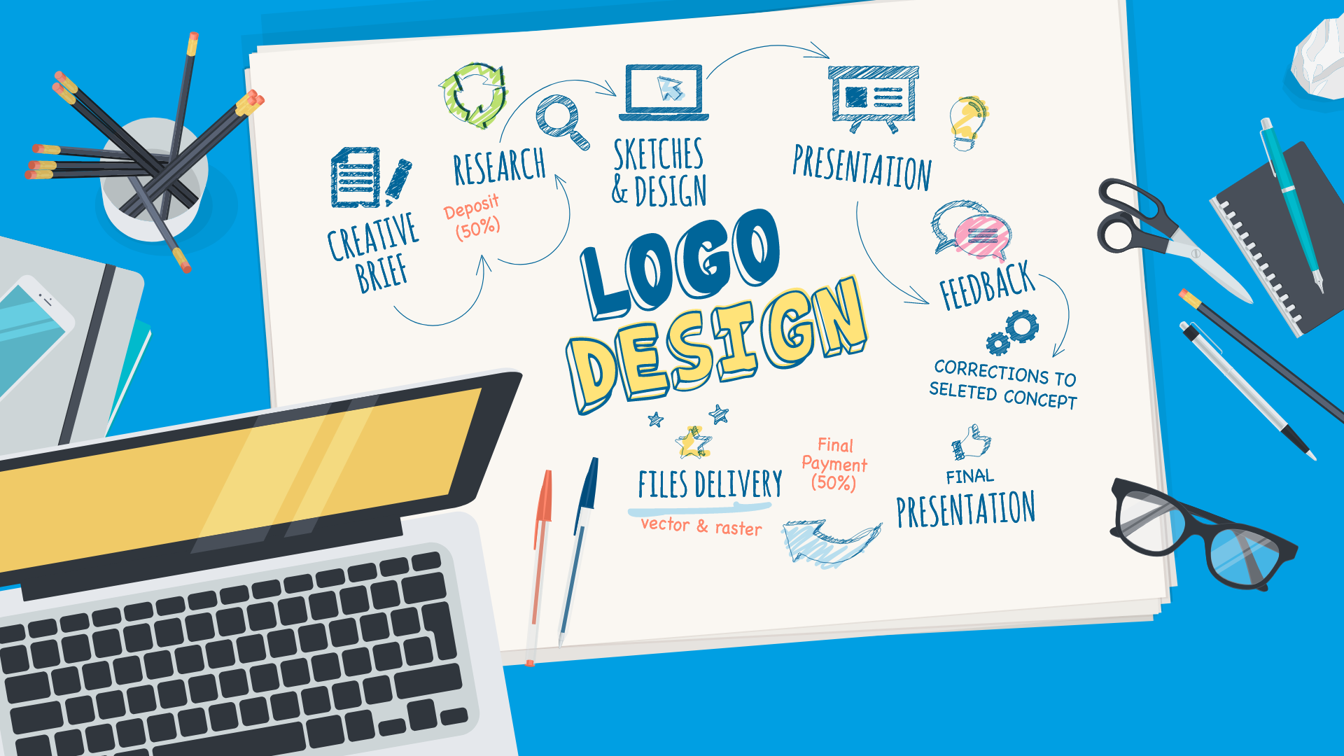
In this post, we are going to be looking at the logo design process from the initial concept ideas through to the rollout of the selected logo.
If you are planning a new logo, for a rebrand or a startup, our free logo brief download will help you get the most out of the project.
Case Study: Bishop’s Stortford Food Bank
A local Food Bank charity approached us and asked for a more recognisable brand. Something that would get noticed and would be easy to apply to marketing material.
Logo design
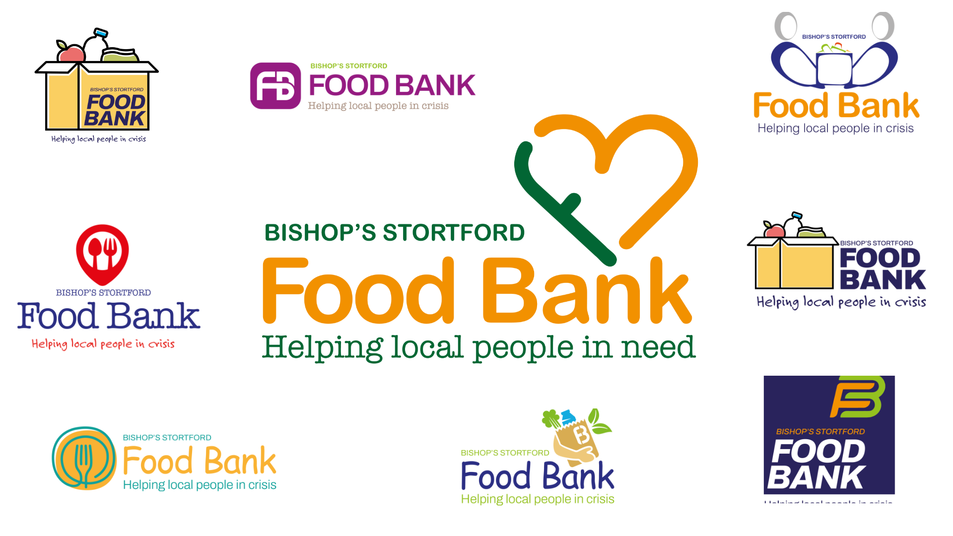
During the design process it was decided to offer variations on the logo, as well as different colourways and typeface style we felt some could have a graphic of a ‘food package’. Bright colours were used to give the brand a strong visual impact.
The strapline was from their previous logo and it needed to be integrated into all of the designs.
We provided various options for the client to consider, a few examples are shown below. Once a preferred option was chosen, we created variations of the logo, suitable for different uses. We then supplied the logo in a number of file formats for full flexibility and compatibility.
Roll out
The new brand was used as part of the new website design we created for them, as well as other marketing material. For example, the logo has been printed on a simple pop-up banner. Moving forward we will continue to support the rollout of their new logo across a range of marketing collateral.
Stage 1: Logo research and initial briefing
The first stage of logo design is research. This is where we will get to know your company, your competitors, and your target market. We will also look at any existing brand guidelines you may have and where the logo will be used.
All of this information will be used to create a logo brief. This will be used to guide the logo design process and ensure that we are on track to meet your objectives.
This step is important as it lets our designers tailor all of the designs to your individual business needs and highlights what media the logo will be used on.
Our in-house designers will work with you to identify and highlight the key areas that your logo should focus on. This can include the target market, the company values, and any other important factors that make your business unique.
We have over 30 years’ experience working with businesses of all sizes so we know what it takes to create a logo that will help your business succeed.
Case Study: Augment Corporate Finance
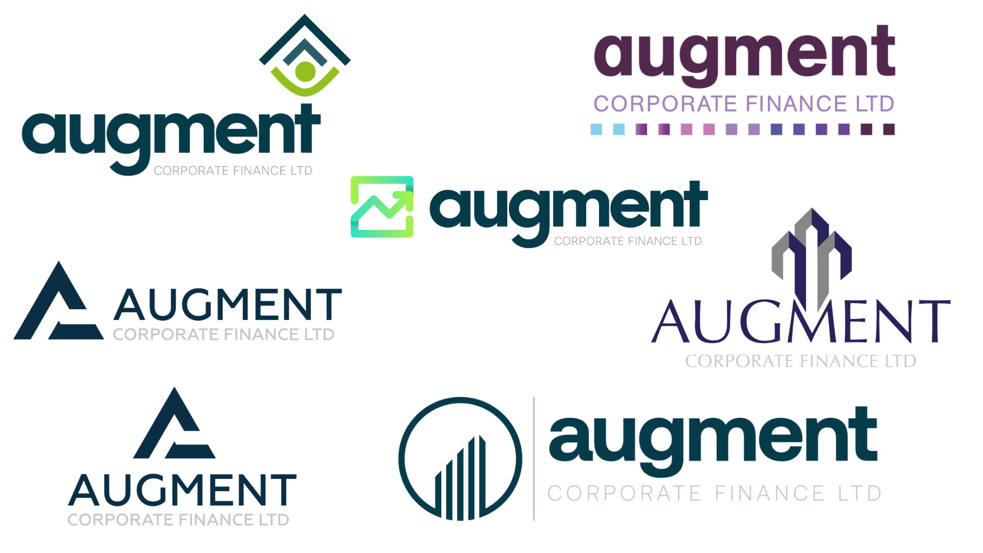
Martyn asked us to produce a brand for his new company, Augment Corporate Finance, which provides funding solutions that are appropriate for specific business needs from invoice finance to asset based lending and includes acquisition/MBI/MBO equity solutions. Augment also provides advisory services in growth strategy, M&A, and turnaround/restructure activities.
From the outset, It was important to Martyn that the brand would represent Augments key services of funding and advisory for growth, and that alongside the new branding, Martyn wanted to partner with a creative agency that would also produce/host a new website and provide corporate stationery and business cards etc.
Logo design
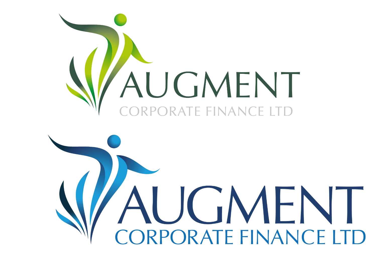
Various logo options were produced with various icons used, along with different typefaces and colourways. The initial designs were presented, and the client really liked one of the options but felt it was not quite right. Going through a process of amends and changes we felt it would be better to ask the client to come in and sit with the designer and see the logo take shape ‘live’. After a successful meeting, his new corporate was ready for implementation.
Roll out
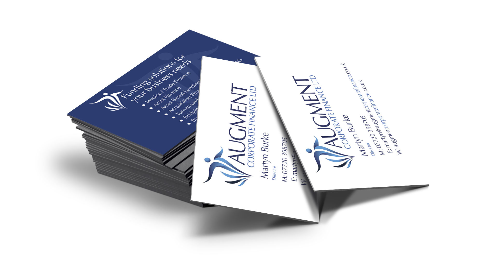
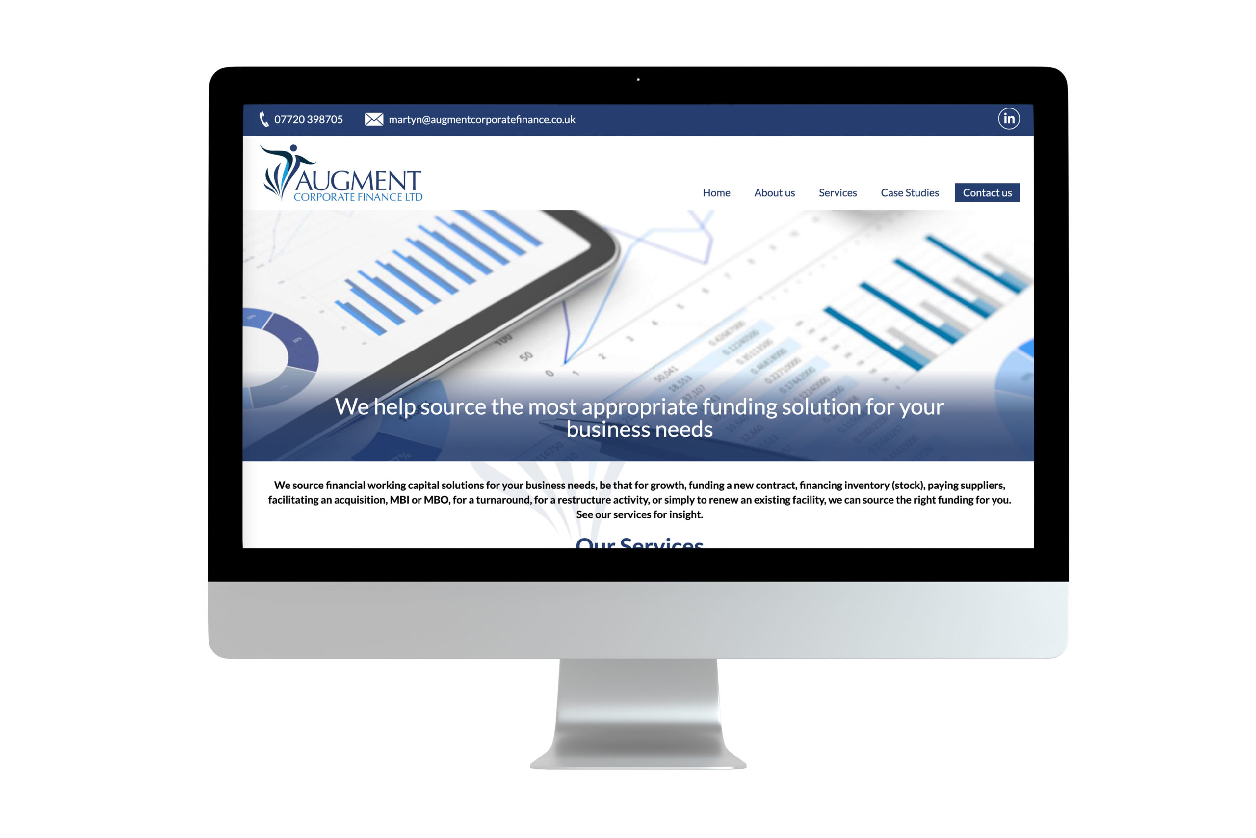
The colour pallet was applied to both stationery and the new website. As with the logo the final changes and amends to the website were carried out ‘live’ only through Microsoft Teams online.
Testimonial
“I viewed a number of creative agencies in preparation as to whom I may partner with. The team at Simpsons Creative took the time to get to know me and my business proposition, taking great care to understand the individual service offerings, and the linkage between them. Throughout the project they were on hand to answer any queries I had, and were proactive and thought provoking to ensure that the project was a success.
The initial logos ideas presented helped to direct the overall feel of the logo and the meeting with the designers in the studio to fine-tune the selected logo really made a difference. I could see the changes in real-time and discuss the implications of the changes on the rollout of the logo making sure it was ideal for all use cases. I certainly feel that the logo represents Augment’s ethos of solidarity, confidence, responsiveness, and providing growth opportunities for its clients.
The team was able to work on the new website design and build alongside the development of the logo with the final logo version dropping in painlessly when ready. I appreciated the same level of detail and proactiveness with the website design, having teams meetings to review the new site and again seeing real-time changes before it was made live. The WordPress training given was excellent and very useful as it allows me to update the content myself as when required, although, Simpsons Creative will undertake such activity for you if you require.”
Martyn Burke, Managing Director
Stage 2: Logo concept generation
Once we have a solid understanding of your company and what you are looking for in a logo, we will start generating concepts.
Our logo designers will create a range of concepts that explore a range of different directions. This gives you the opportunity to see how the logo will work in various formats and to get feedback from your team.
Once we have a selection of logo concepts, we will present them to you and get your feedback. This is where the logo design process really starts to take shape.
Stage 3: Logo refinement
After we have received your feedback, we will start refining the logo designs. This is where we will focus on perfecting the logo so that it is ready for use.
We will take into account all of the feedback you have given us and make sure that the logo meets all of the criteria in the brief. This is also the stage where we will add any finishing touches, such as selecting the perfect font for your logo.
At this stage, some clients also enjoy having a hands-on design meeting. This allows them to really refine the final logo design to their exact needs and have a final say on the development of the logo.
Stage 4: Logo rollout
Once the logo has been completed, we will provide you with all of the necessary files. This will include high-resolution versions of the logo that can be used for print, as well as low-resolution versions that can be used for website and social media.
If required, we can also provide you with a brand guideline. This will outline how and where the logo can be used, as well as any restrictions that should be followed.
We can also assist with updating websites, brochures, flyers, socials, and other marketing collateral with your new logo ensuring your new logo rollout goes smoothly.
Stage 5: Ongoing support
Your logo is an important part of your brand identity, and we want to make sure that it is used correctly. We offer ongoing support to all of our clients, so if you have any questions or need any assistance, we are always here to help.
Following these simple steps will help ensure that your logo design process runs smoothly and that you end up with a logo that you love.
If you have any questions about logo design or the process, please don’t hesitate to get in touch. We would be more than happy to help.
Case Study: TREIO
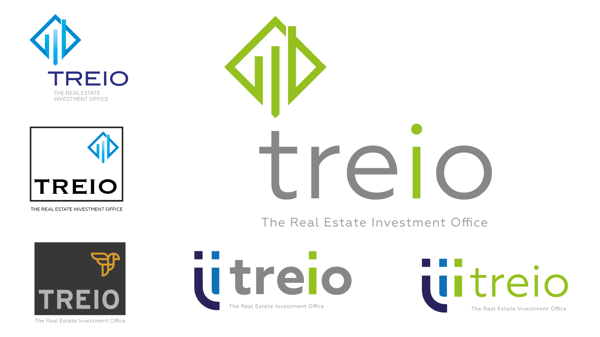
An existing client decided to start a new investment company. The brief was for a simple yet elegant design. As we had also been asked to design the website and other marketing material, we felt that implementation would not be an issue and typeface and colour pallet could be decided once a design has been selected.
Logo design
As the name suggest there are three members of this new company, so we felt that implementing that into some of the designs would be a nice feature. Sans serif fonts proved to be favourite, although the client in this case did not decide on a logo. Instead it was a combination of two. A few options were provided for discussion and their new corporate was finished.
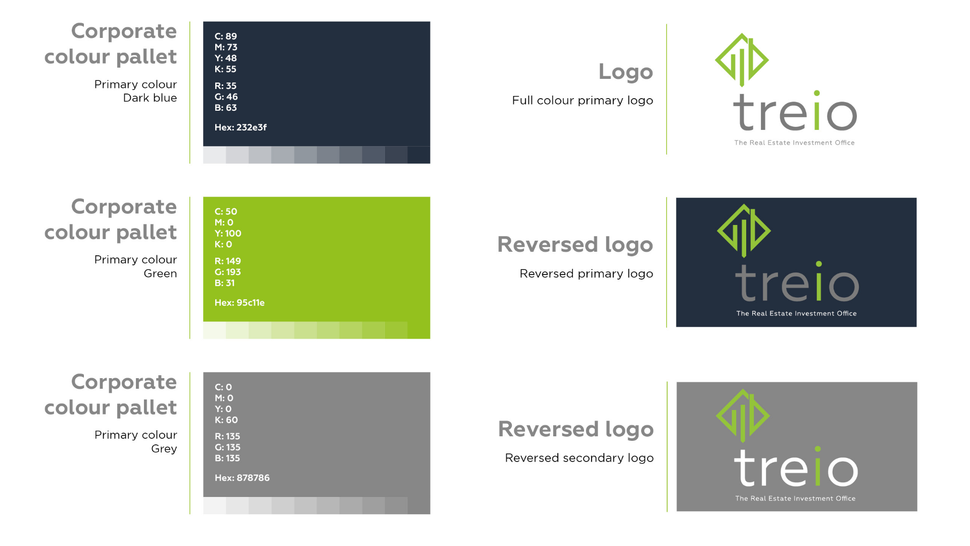
Even though we were producing most of the corporate material we felt a brand guideline was essential for this new company. As this would ensure the new brand was applied correctly and with colour and typeface being consistent across the marketing mix.
Roll out
A new website, stationery, PowerPoint, newsletter and advertising were the first items to be created. The PowerPoint was an interesting one as the client wanted us to design them a slick pitch document, but that they could also update in the future.
