
In the digital age, your website is often the first impression potential customers have of your business. For small business owners and digital marketers, creating an impactful website is crucial. But there’s a catch—designing a website can be filled with pitfalls that can hinder its success. In this blog post, we’ll explore common website design mistakes and how to avoid them.
The Power of Effective Website Design
Before we dive into the common mistakes, let’s emphasise why effective website design is so important. A well-designed website can:
- Enhance user experience
- Boost search engine rankings
- Increase conversion rates
- Build brand credibility
However, one wrong move in your design can lead to a host of issues, from high bounce rates to decreased sales. Understanding these potential pitfalls will help you steer clear and ensure your website works for you, not against you.
Cluttered Layouts
A cluttered layout can overwhelm visitors and make it difficult for them to find the information they need. Here are three reasons why a clean layout is essential:
Improves Navigation
When your website layout is cluttered, users struggle to find what they’re looking for. A clean, organised layout improves navigation and lets users get an overview of your website which, in turn, makes it easier for visitors to locate the information they need quickly.
Enhances User Experience
A clutter-free design enhances user experience by providing a visually appealing and easy-to-understand interface. This encourages users to spend more time on your site, exploring your content and offerings. Cluttered websites can make it difficult to find the information users are after and they will likely click back to the search results in search of another website (known as bounce rate)!
Boosts Conversion Rates
With a clean layout and clear calls to action, users can quickly see the next steps in the journey through the website, which will help to improve the conversion rates of your visitors. Simply put, the easier you make it for users to find the button, the more likely they are to click it! The same is also true with the number of calls to action, if you have too many it will divide the users attention and take priority away from the individual buttons.
How to improve?
Taking a unbiased view of your website will help you to see how cluttered it currently is, asking friends, colleagues or family for help with this will remove your own biases. A quick way to tell how cluttered the website is would be to show it to someone for 5-10 seconds, then after ask them what the main CTA or takeaway from the page was. If they can’t answer then the page was too cluttered to communicate the key CTA and needs reworking.
Neglecting Mobile Responsiveness
With the majority of internet users accessing websites via mobile devices, neglecting mobile responsiveness can be disastrous. Here’s why:
Reach a Larger Audience
Ensuring your website is mobile-responsive means it will display correctly on all devices, from smartphones to tablets. This expands your reach to a larger audience and prevents potential customers from bouncing due to a poor mobile experience.
Improve SEO
Search engines prioritise mobile-friendly websites in their rankings. A mobile-responsive design improves your SEO, making it easier for potential customers to find you through search engines.
Enhance User Experience
A mobile-responsive website provides a seamless user experience across all devices. When users can easily navigate your site on their phones, they’re more likely to stay longer and engage with your content.
How to improve?
First make sure your website is actually responsive, visit it on a range of devices to see if it adapts and how. When reviewing the website on the devices make sure they function as expected and key CTA are visible and working, you can test your websites responsiveness with online tools as well.
If your website is not responsive it’s time to look at updating it!
When designing a new website, keep all screen sizes in mind throughout the process to ensure any designs/plans will scale down to mobiles.
Overusing Flashy Elements
While flashy elements like animations and videos can add visual appeal, overusing them can backfire. Here’s why moderation is key:
Speed Matters
Flashy elements can slow down your website’s loading speed. Slow-loading websites frustrate users and lead to high bounce rates. Prioritise speed over excessive visual effects to keep visitors engaged.
Distraction from Content
Excessive animations and videos can distract users from the main content. When visitors are bombarded with flashy elements, they may miss important information or calls to action.
Accessibility Concerns
Not all users can access flashy elements due to device limitations or disabilities. Ensure your website is inclusive by using animations and videos sparingly and providing alternative content options.
How to improve?
Take the time to review the website, make sure that the key CTAs are not being lost to other elements and make sure the page load times are fast enough not to put users off. When adding new features always ask yourself if it’s for the users benefit or if it’s just a flashy add-on.
Ignoring User Feedback
User feedback is a goldmine of insights that can help you improve your website. Ignoring it can lead to missed opportunities for enhancement. Here’s why listening to your users matters:
Identify Pain Points
User feedback highlights pain points and areas where your website may be falling short. By addressing these issues, you can create a more user-friendly experience.
Enhance User Satisfaction
Incorporating user feedback shows that you value your visitors’ opinions. This enhances user satisfaction and fosters a sense of loyalty to your brand.
Continuous Improvement
Regularly seeking and acting on user feedback allows for continuous improvement. Your website can evolve based on real user experiences, keeping it relevant and effective.
How to improve?
Getting users feedback throughout the lifecycle of a website is key, you can hold focus groups to review new website designs while they are still under development. For live websites, you can ask users to locate key actions or information while asking them about their thought process, using this feedback you can see what areas may need improvement. For example, if users are constantly missing key products it might be time to do some keyword research and update product categories to make sure you showing users the categories they are searching for!
Poor Navigation Structure
A confusing navigation structure can frustrate users and drive them away. Here’s why a organised navigation is crucial:
Ease of Use
Clear and intuitive navigation makes it easy for users to find what they’re looking for. When visitors can quickly access desired information, they’re more likely to stay on your site.
Improved User Experience
A well-structured navigation enhances user experience by providing a logical flow. Users can seamlessly move from one section to another, exploring your content without frustration.
Higher Engagement
An organised navigation structure encourages users to explore more pages, leading to higher engagement. When visitors can easily discover different sections, they’re more likely to spend time interacting with your content. If users find it hard to navigate the website they are less likely to ‘risk’ exploring the rest of the website and getting lost down a rabbit hole.
How to improve?
For new website projects, take the time to review all pages on the website, look at existing pages and categories but also look at your products/services to make sure they are all clearly shown. For larger websites with lots of pages it’s time to review how the pages are subdivided and which pages are important enough to form part of the navigation and which are subpages.
For existing websites, changes to the navigation can be a big undertaking, when reviewing the content for the site look at if the new navigation structure is in-line with the existing design or if it needs reworking. Any changes to navigation need to ensure there are no broken links with removed pages redirected to other areas of the site.

Lack of Call to Action Buttons
Call to action (CTA) buttons guide users towards desired actions, such as making a purchase or signing up for a newsletter. Here’s why including clear CTAs is essential:
Guide User Behaviour
CTAs guide user behaviour by providing clear instructions on what to do next. This reduces confusion and ensures users take desired actions.
Increase Conversions
Well-placed CTAs can significantly increase conversion rates. When users know exactly where to click, they’re more likely to complete the desired actions, such as making a purchase or filling out a contact form.
Enhance User Experience
CTAs enhance user experience by providing a clear path for navigation. Users appreciate knowing what steps to take next, creating a smoother and more enjoyable interaction with your website.
How to improve?
Looking at the positioning of your CTA will help you judge if they are effective, make sure they are clear to users at relevant points on the website, for example you may have one in the header and repeated again at the end of the content.
Review the copy used in your CTA, make sure they are not only clear about what the action will do, e.g. ‘buy now’, but also encourage visitors to click. Effective CTA copy is a whole topic in itself, but making sure they are clear and credible is a good first step.
Overloading with Text
While content is important, overloading your website with text can overwhelm visitors. Here’s why balancing text with visuals is crucial:
Improve Readability
Balancing text with visuals improves readability. Break up long paragraphs with images, infographics, and headings to make your content more digestible.
Enhance Engagement
Visuals enhance engagement by capturing the user’s attention. Incorporate relevant images and graphics to complement your text and keep visitors interested.
Convey Information Efficiently
Visuals can convey information more efficiently than text alone. Use charts, graphs, and diagrams to present complex data in a visually appealing and easily understandable format.
How to improve?
Review the content on your website and look for opportunities to complement text with visuals, such as images, videos, and infographics. Also consider using headings and bullet points to break up long paragraphs and make the content more scannable for users.
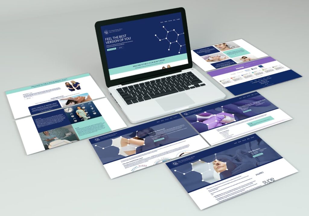
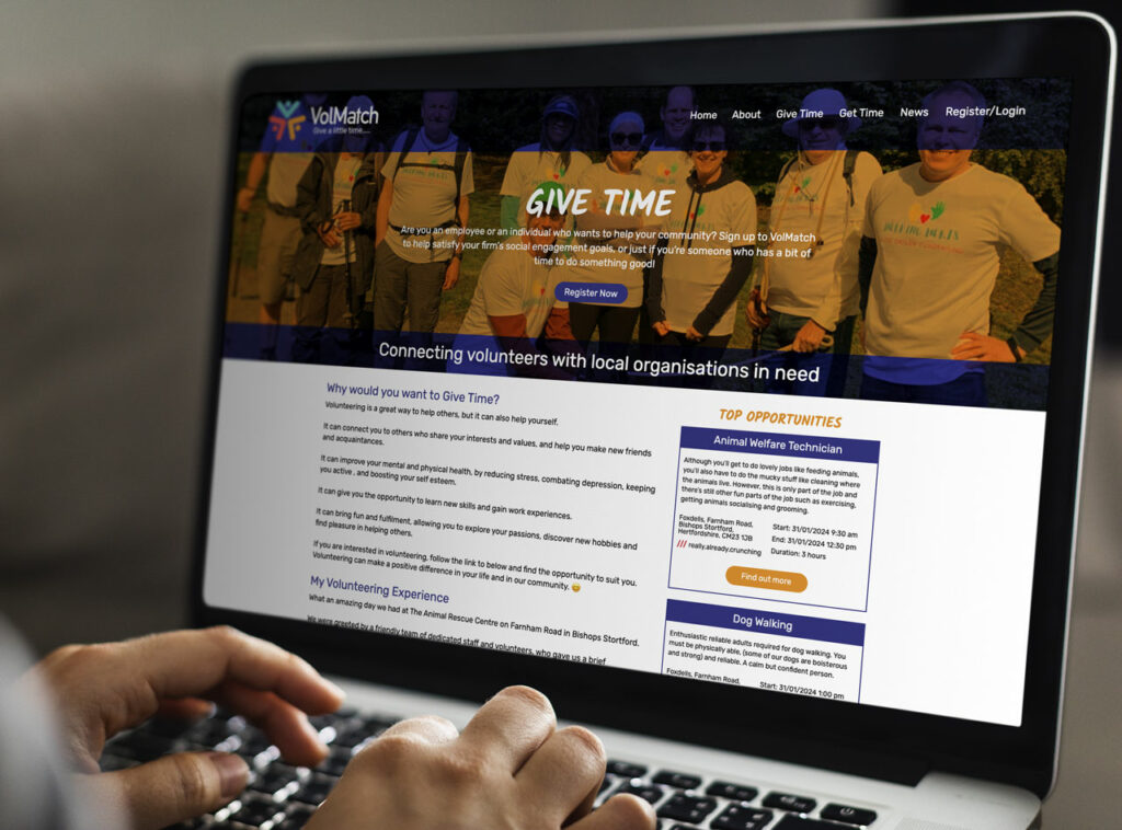
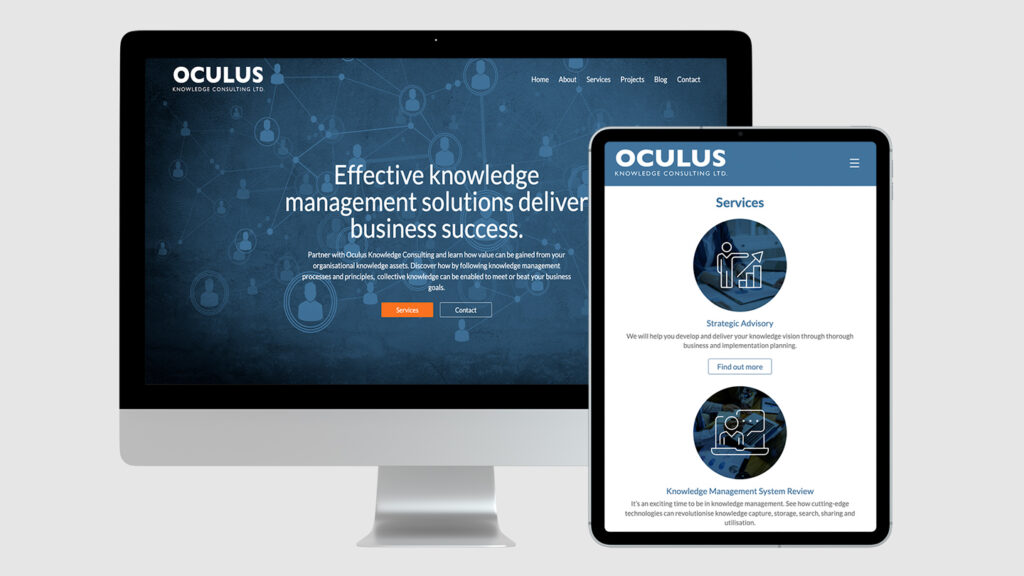
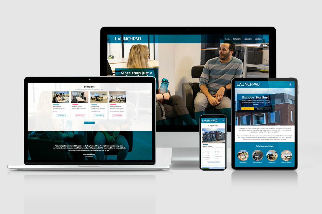
If you have a lot of data or complex information to convey, consider using charts, graphs, or diagrams instead of long blocks of text. This not only makes the information easier to understand but also adds visual interest to your content. However, make sure that the visuals you use are relevant and add value to the overall message.
Failing to Optimise Images
Large, unoptimised images can slow down your website and affect user experience. Here’s why optimising images is essential:
Improve Loading Speed
Optimised images improve loading speed, ensuring that your website loads quickly. Fast-loading websites provide a better user experience and reduce bounce rates, this is even more true for mobile visitors who have less bandwidth.
Enhance SEO
Optimised images contribute to better SEO. Search engines prioritise websites that load quickly and provide a smooth user experience, leading to higher rankings.
Maintain Quality
Optimised images maintain quality without sacrificing speed. Use image compression tools to reduce file sizes while preserving visual appeal.
How to improve?
Review the images being used, make sure that you are uploading images at the resolution they are needed and in modern suitable file formats. If using a CMS like WordPress, look at image optimisation plugins that can help take some of the hassle out of this process.
Ignoring Analytics
Analytics provide valuable insights into your website’s performance. Ignoring analytics means missing out on opportunities for improvement. Here’s why tracking and analysing data is crucial:
Measure Success
Analytics allow you to measure the success of your website. Track key metrics such as traffic, bounce rates, and conversions to understand how well your site is performing.
Identify Trends
Analysing data helps you identify trends and patterns in user behaviour. Use these insights to make informed decisions and optimise your website for better results.
Continuous Improvement
Regularly reviewing analytics allows for continuous improvement. Make data-driven adjustments to enhance user experience, increase engagement, and achieve your goals.
How to improve?
Make time regularly to review the statistics of your website, use the information to review your content strategy and make adjustments in your plans to focus on the more popular areas of your website. If your key products/services are not seeing high numbers of visitors, review the content of those pages and see if there is room for improvement to help boost the SEO of these pages and, in turn, drive visitors to these key pages.

Conclusion
Avoiding common website design mistakes is crucial for creating an effective online presence. By understanding and addressing these pitfalls, small business owners and digital marketers can build user-friendly websites that drive engagement and conversions.
Remember, your website is often the first impression potential customers have of your business. Make it count by investing in effective design and continuously improving based on user feedback and analytics.
Ready to enhance your website design? Start by addressing these common mistakes and watch your online presence thrive. For more personalised guidance, consider booking a consultation with our expert team.
We’re here to help you create a website that stands out and delivers results.


