You may have heard people talk about typography, but what exactly is it and why won’t your designer friends stop going on about how important it is?
So, what is typography?
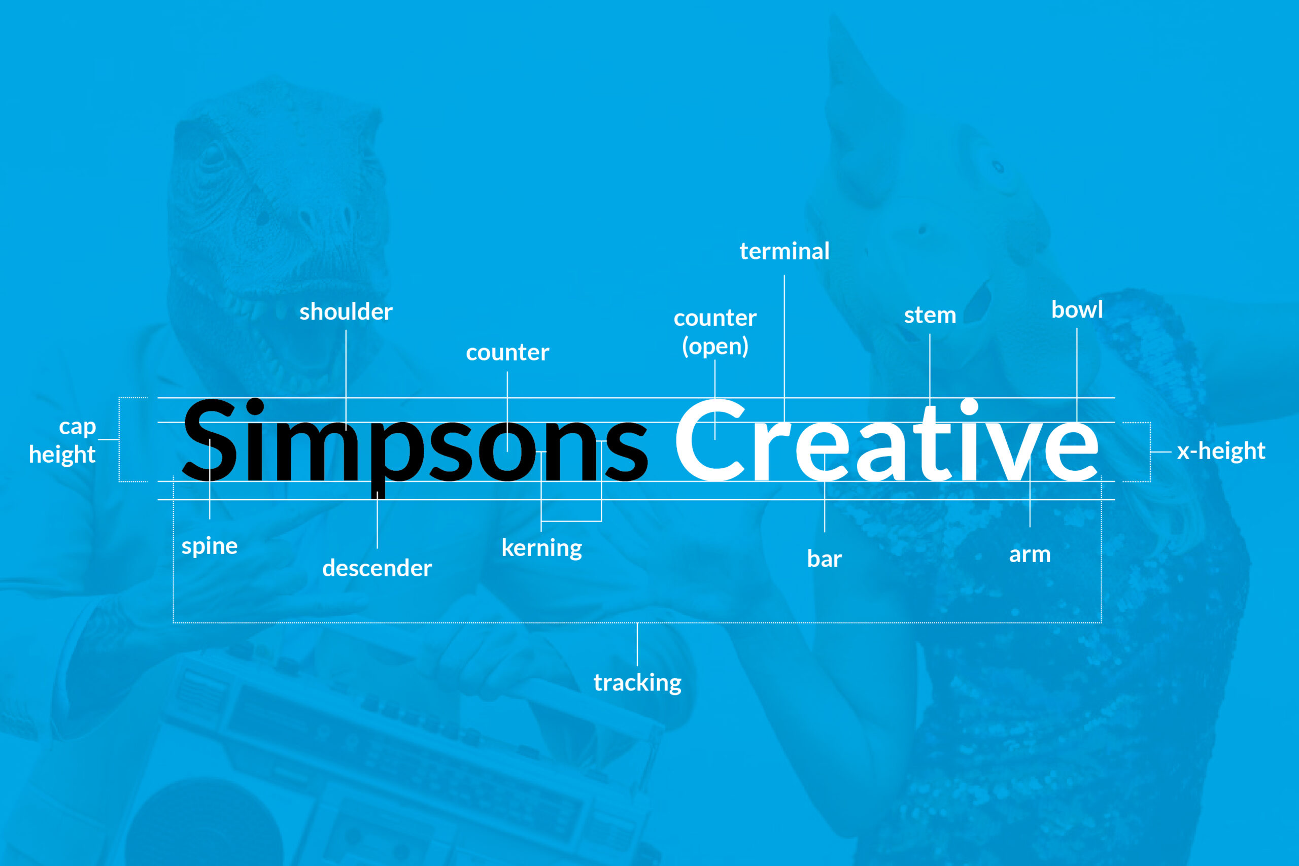
Typography (noun) the art or procedure of arranging type or processing data and printing from it.
Typography is arranging text in an engaging, creative and appealing way that gets the message across to your target audience. It includes everything from the layout to spacing, sizes to hierarchy, colour and weight of the lettering.
Why is typography so valuable to a brand?
Typography is everywhere. Anything that includes text has some degree of typography. Everything in your brand from your website, logo, social media, posters, signage, packaging, emails, documents that contain words is typographic. Without knowing typography is a huge part of your visual brand. Since it makes up such a large percentage of your brand identity, you must spend time getting this right.
Typography builds brand recognition
Typography makes up a huge percentage of your brand’s visual identity which is fundamental to how your audience recognises and remembers you.
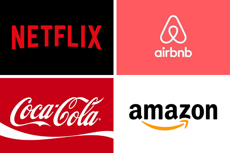
Most of us can remember and instantly identify the fonts associated with large brands such as Disney, Amazon and McDonald’s to name just a few. Many companies such as Netflix, Airbnb, and Coca Cola have all created their own typeface, in a move to make typography a crucial part of their brand identity.
Take a look at brands that inspire you and acknowledge their typography. Is it appealing? How does it make you feel? Is it consistent throughout? Is it recognisable or forgettable? Do you know another brand with the same typography?
Now think about your own business, conduct a review of the typography across all of your branding. Make some adjustments if it isn’t consistent throughout. Think about the best fonts for your brand and read next weeks blog to learn how to choose an effective brand colour palette.
Typography has meaning
Just like the colour has meaning for your brand, typography is equally as powerful in representing the values and character of your brand. Each kind of typeface has a different set of meanings and therefore will create a different representation of who you are and what you stand for as a brand.
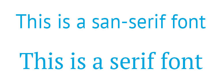 The reason there are so many different kinds of typefaces is that they all offer a hugely different mood or impression. For example, sans-serif typefaces are typically modern-looking they are clean, simple, easy to read. So, if that is what you are trying to convey, sans-serif would suit your brand. Or you have serifs, these are often considered old-fashioned as they give a traditional look. Typically, they are known to be easier to read for long-form content, such as blogs and books.
We’d love to hear if this has made a difference in how you view your brand and if you are considering changing it!


