The Client
TREIO (The Real Estate Investment Office) provides discreet, independent, strategic, acquisition and asset management advice to High-Net-Worth Individuals (HNWIs), families of wealth, trusts and charities concerning all aspects of real estate investment in the UK and Europe; to enable their clients to successfully achieve their investment objectives. In March 2021, they were awarded ‘Top Recommended’ Adviser status by Spears.
With that being said, we knew the branding had to match the level of service TREIO provide to their clients.
The Brief
Our brief was to develop and design a new brand and online presence in both the London and Geneva markets. The project encompassed the creation of a website, logo and corporate identity including business stationery and templates for PDF information sheets and other documentation. Overall, the brand was to be ‘upmarket, but fresh’.
The Solution
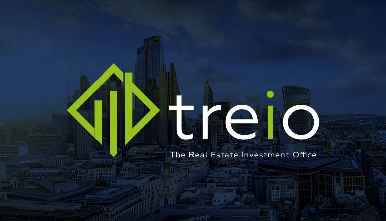
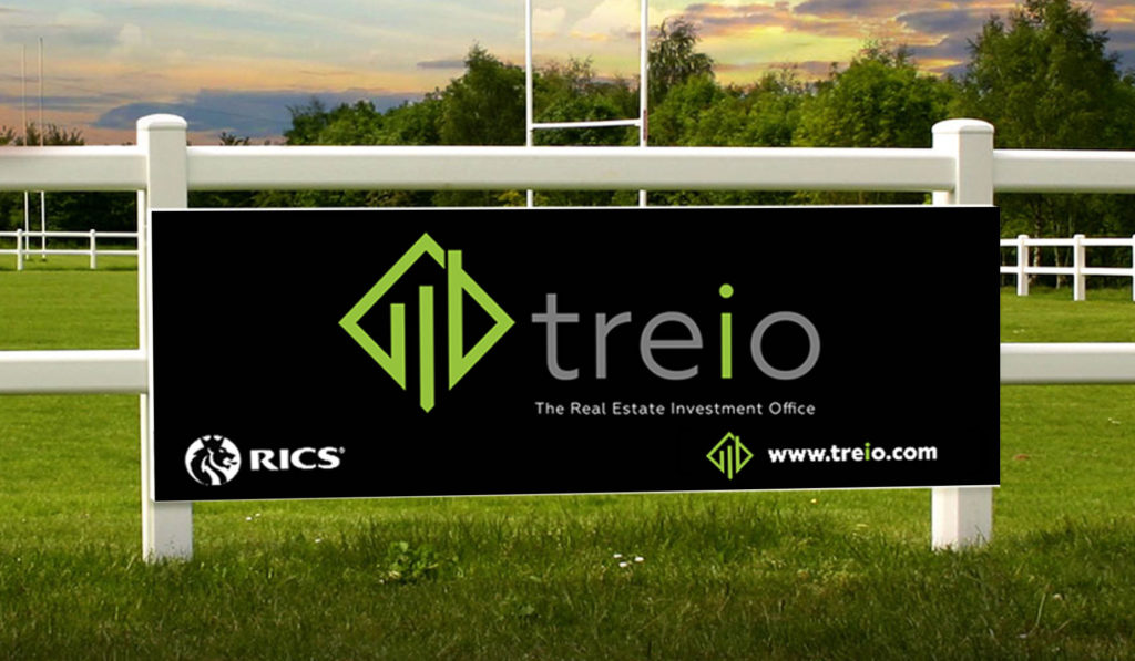
The nature of the business suggested a formal, geometric iconography rather than a freeform design approach. We developed an angular, dynamic icon with an ascending graph motif, and a green ‘I’ for investment picked out in the name style.
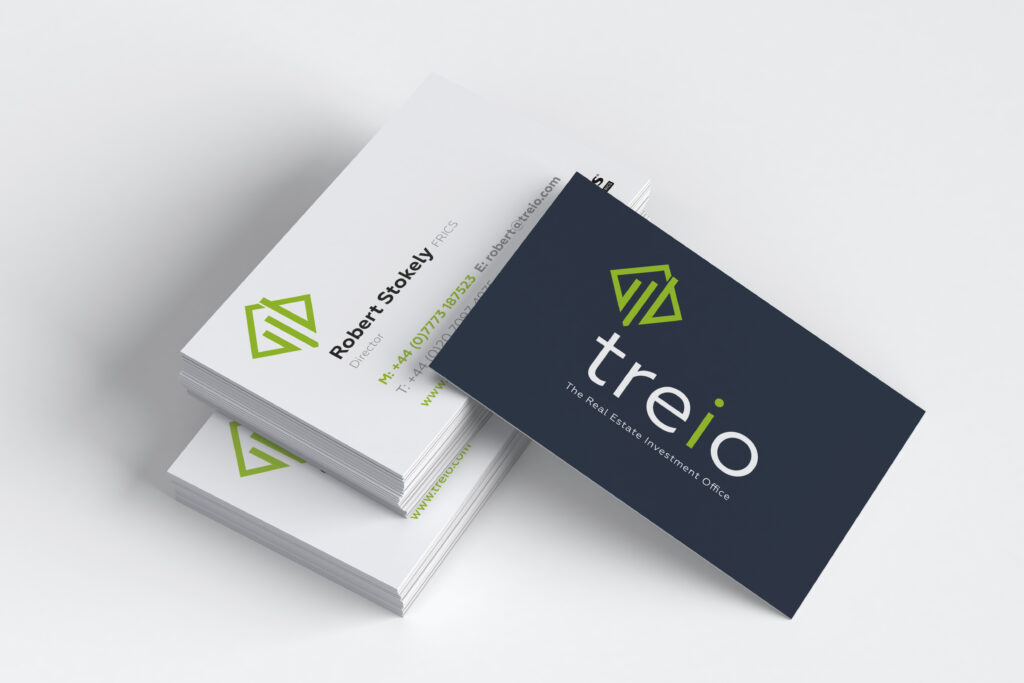
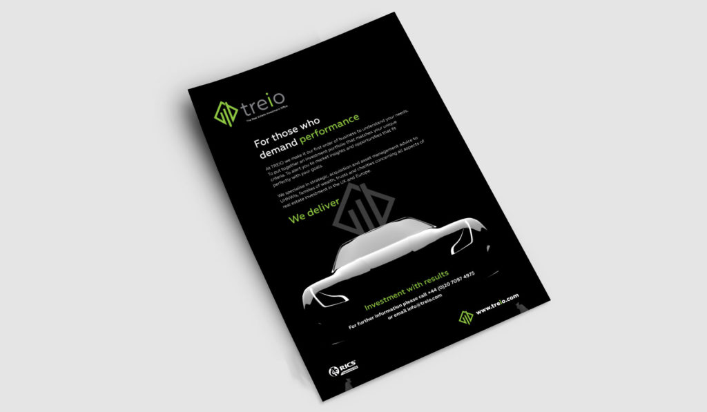
Once agreed, we then created a corporate identity that set out the application of the logo, name-style, and colour palate (leaf green, dark blue and white) across the whole range of marketing collateral.
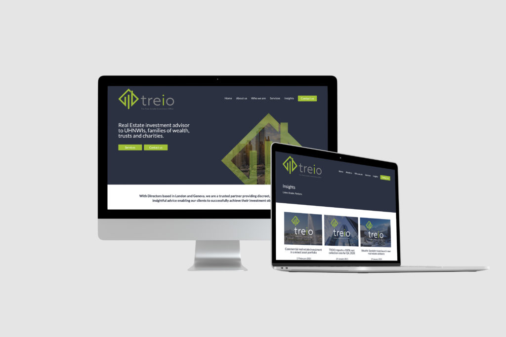
With the website, we created a custom-built design that takes users through the key areas of the business with links to additional information via clear calls to action.
The website is fully responsive and gives the client the ability to update and add content themselves. This works particularly well in the ‘Insights’ section of the website which the client uses to showcase their knowledge and experience.
Logo
When creating the logo, we wanted it to reflect the light, airy design of the refurbished building, especially its spacious and adaptable interiors, emphasising the inner space of the letters A and H without defining the outer edges helped to create an effective branding that we could then implement across all the promotional elements.
To ensure brand continuity across all marketing materials, we produced brand guidelines to enable consistency of image and the brand story.
Website
With the branding in place, we created two website designs to explore two different concepts. Giving the client input into the design approach and allowing them to direct the project to a website they wanted.
The final design has a clean, modern look. The branding was applied throughout, keeping this concept in mind with the brand colours used to draw attention to CTA (calls-to-action).
The layout of the home page has been designed for users to navigate the site easily. The header was kept clean and simple, so it didn’t detract from the CTAs. Elements from the logo have been used to add graphical interest while promoting the branding throughout.
The services section of the home page has been designed to quickly drive users onto the sub-pages, helping users get the information they require without any hassle. Each has a designated icon that visually links the services. These icons have become part of the brand and give visual interest to other marketing materials such as PowerPoint presentations.
For the client, showcasing their industry knowledge was vital, so we have incorporated a clear ‘Insights’ section, showcasing the latest three blog posts on the home page.
The goal of the website is to drive interested visitors into making contact. With this in mind, a clear CTA signs off the home page encouraging users to convert across.
The website has been built using WordPress, allowing the client to update the content on the website themselves, including blog posts. As with all new websites we create, this one has been built to be fully responsive, giving users the best experience possible across different devices and screen sizes.