The Client
Wrenbridge is one of the leading property companies in the UK. Founded in 1993, they have been successfully developing and investing in properties across the UK, with assets under management in excess of £900 million.
Wrenbridge have been clients of Simpsons Creative property marketing since their inception. We created the company’s original brand and corporate identity and have subsequently produced marketing material for many of their projects.
The Brief
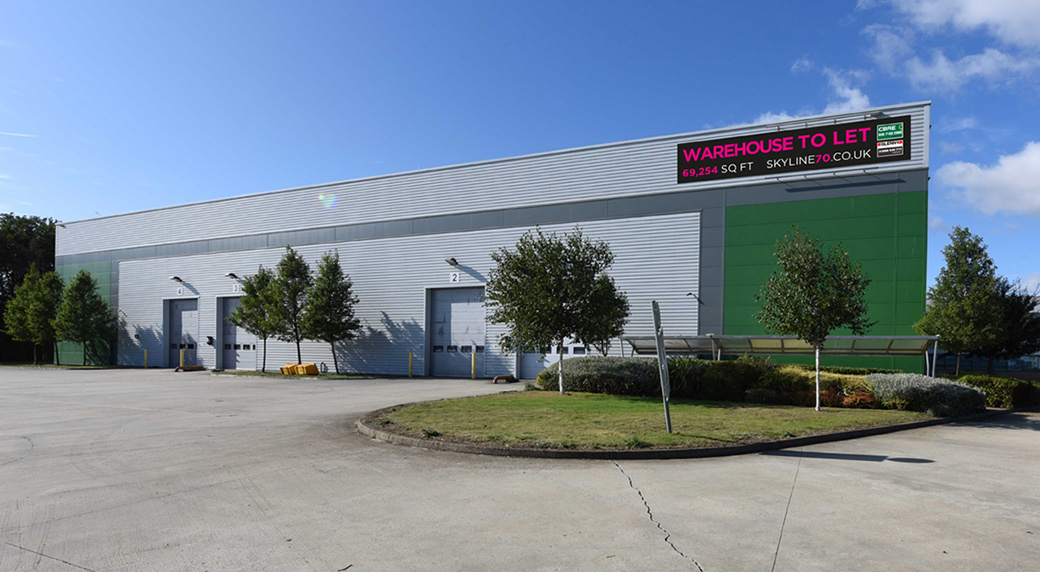
The brief was to create a site-specific brand for a major warehousing and office complex at Skyline Business Park, Braintree Essex, and associated marketing material reflecting the scale and prestige of the project.
Creative Proposals
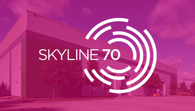
Since Skyline is recognised as a prominent, strategically located business park, we recommended that the building capitalises on these brand assets by retaining the name of the park in its title, ‘Skyline 70’, the latter being the plot number.
The key features of the building to be emphasised were its modernity and its centrality. These were accentuated in the logo design with the use of a lightweight sans serif typeface and an icon of concentric broken circles encompassing by the name ‘Skyline 70’, with the ’70’ occupying the central space. Various other iterations were also presented, with the circular icon forming the ‘0’ of ‘70’.
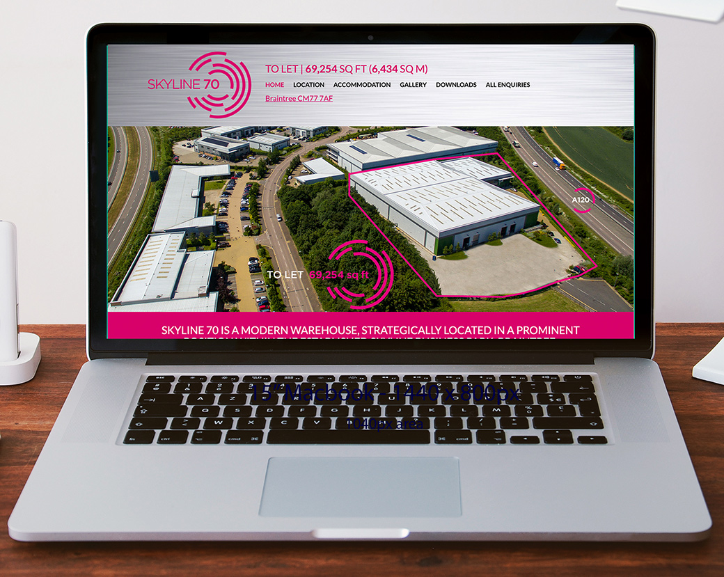
The chosen logo was also carried over into the branding of a site-specific website which gives a full profile of the development including location, specification, accommodation and local amenities. It also acts as a referral point for enquiries generated by advertising and online searches.
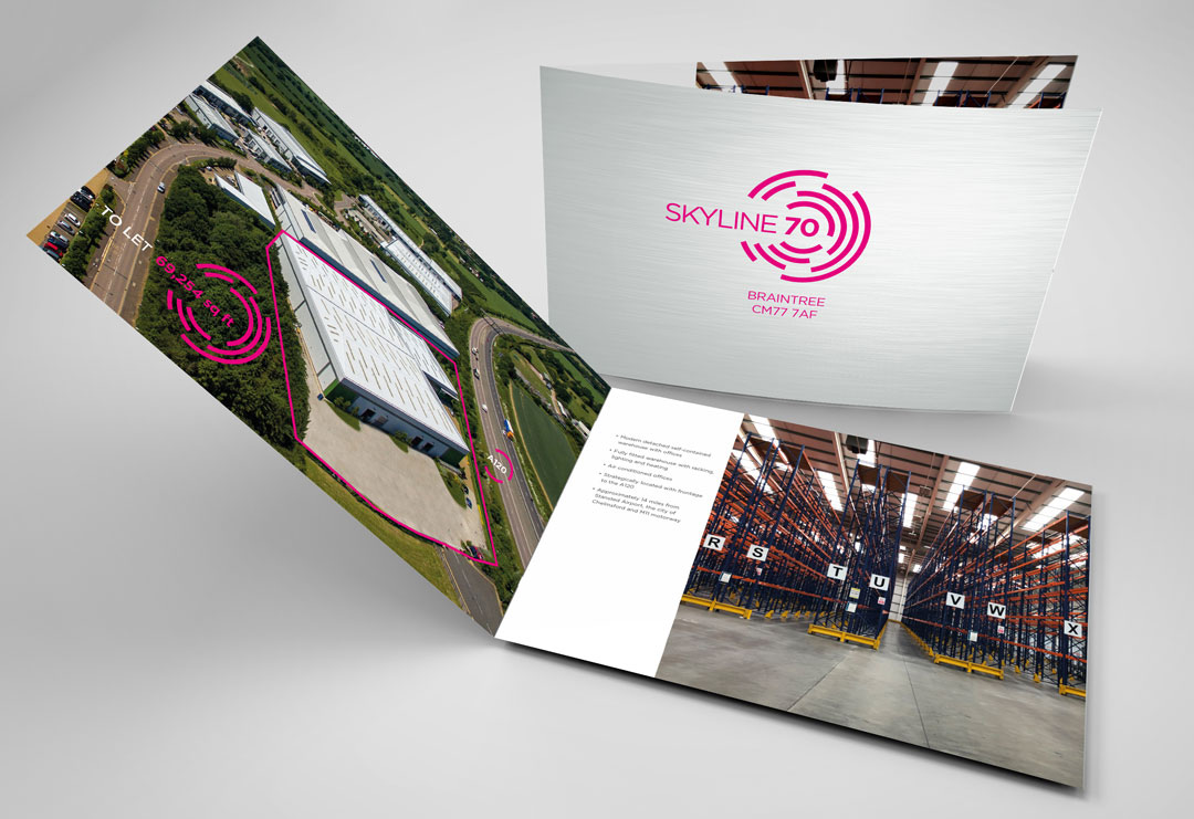
For a development of this importance, it was decided to produce a prestigious printed brochure for distribution to potential occupiers and property agents. To reflect the modernity and high specification of the project the front and back covers of the brochure were finished in a brushed steel effect as a fifth colour with the ‘Skyline 70’ logo overlaid in shocking pink – a daring departure from the usual ‘safe’ corporate/industrial colourway.
The Result
The client was delighted with the branding implemented it fully in all project-related promotional material. The brochure was well received by potential occupiers, generated numerous enquiries, and a deal was done within three months of the launch.


