
A huge 94% of people say easy navigation is the most useful feature of a website. So, is your navigation working for or against you? Here are some tips for streamlining your website navigation bar so it’s easy to use and looks good.
LIMIT THE NUMBER OF MENU OPTIONS
Your website is a digital tool that should guide users around freely with easy navigation. You don’t want to confuse users with loads of options to choose from. A good rule of thumb is to keep it to between three and six choices. Here’s why:
User Experience (UX)
A short navigation bar is easier and faster for users to read. If they have to hunt for options, they are more likely to leave your website and this isn’t good for your bounce rate.
Search Engine Optimization (SEO)
A short, clear menu makes it easier to understand, for search engines to navigate, and arrange your website.
Design
A short, navigation bar will increase the look of your website and still keep it easy for users to read.
Let’s take a look at some examples.

Do you have a crowded navigation bar, like this? Although they have separated the core navigations, it is still overwhelming as a new user. With 9 initial topics and 14 more under ‘MORE’ as a user, it’s hard to navigate through all of them.
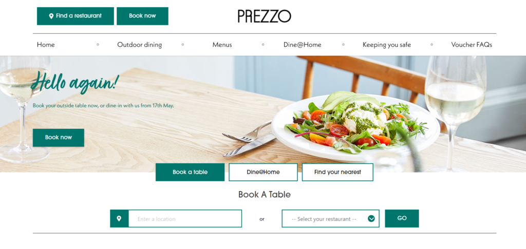
This is much more streamlined, only highlighting the most important information users will probably be looking for. Including clear CTA buttons to help guide users to where they want. Having a reduced number of topics allows users to find their way around the website easier, but also keeping them on your website for longer.
Here at Simpsons, all our websites are built to be responsive across all devices so you don’t need to worry about how it will look on mobile, compared to a desktop.
Top Tip: If you’re struggling to decide what topics you should include in your navigation, we have a sitemap template you can fill out here.
USE SHORT, SHARP NAVIGATION NAMES
Although it isn’t possible for everyone, where you can keep the words you use in your navigation menu relevant, accurate, and short. That way both users and search engines will understand them easily.
For example, try “Contact” rather than “Get in touch with the team” – although they mean the same, users will be looking for the contact page.
CREATE CATEGORIES AND DROP-DOWN MENUS
Drop-downs are a great way to add additional options of interest to your main navigation bar without cluttering it up. For example, instead of having Breakfast Menu, A la carte Menu and Wine List taking up three tabs on your navigation, grouping them under ‘Menu’ with a drop-down is a great alternative to keeping your navigation bar seamless.
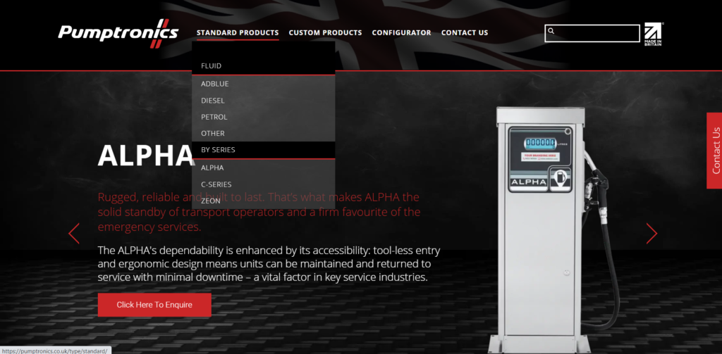
For example, Pumptronics is a website we designed and built. Although we kept the navigation options short some items logically belonged in a drop-down menu underneath the main pages.
BOOST CONVERSIONS RATES WITH A CTA BUTTON
Adding a call-to-action (CTA) button, like ‘Call Us’ or ‘Book Now’, to your navigation bar it’s an easy way to guide your visitors to where you want them to go.
Think of a call-to-action button as a shortcut to the destination you want your website users to go to. You could use it to direct more users to your sales page, get them to book an appointment, or let them contact you in just one click.
If you want to improve the flow and structure of your website, help people find what they are looking for, and simply make your website look better. Get in touch today as we would love to help.


