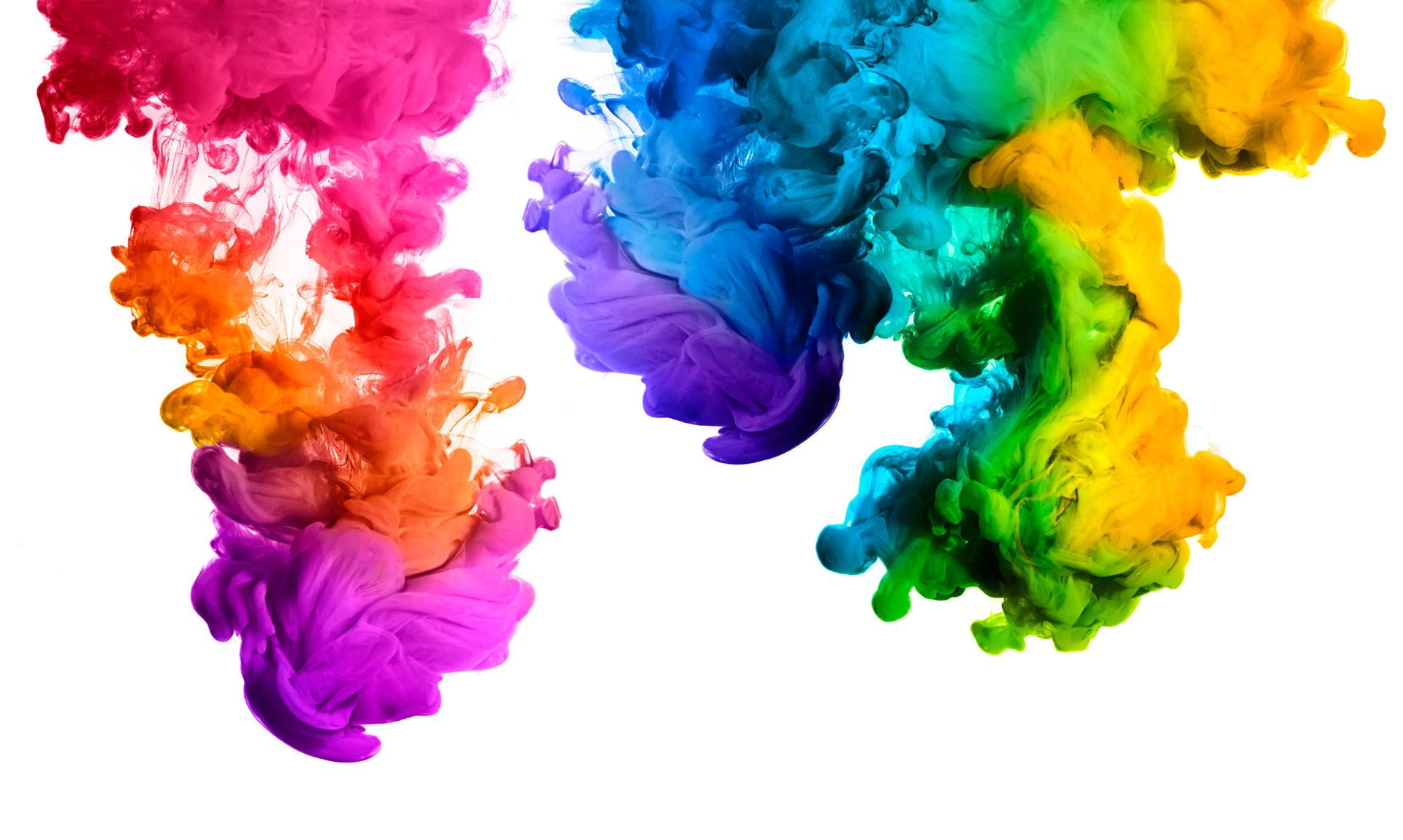
Colours can influence your mood, emotion, behaviour and even the products you choose to buy. Brands will try and grab the attention of their audience by using a colour that will provoke a reaction and influence their decision to purchase. We are going to explore the psychology of colours and the effect they have on your brand while influencing your audience.
Choosing the right colour palette for your brand will set you up for the future and ensure you stay a step ahead of your competitors. To be able to choose the right colours, you have to understand your audience their aim and why they should purchase your product/service. Determining your audience’s personality will be the initial crucial step in this process.
Red
Red represents anything that captures attention such as, excitement, passion, danger, energy, action, movement, you name it. It might be used on a website button when you are about to place an order or a new product packaging, so it catches your eye from a distance. Red is the most intense colour and can provoke the strongest feelings. If used sparingly, red can also express danger or emergency.
Red tends to encourage appetite while attracting attention at the same time. Brands such as Coca-Cola and McDonald’s use red as their main brand colour palette. YouTube, on the other hand, has its logo as a red play button to raise the excitement of watching videos and clicking the play button.

Yellow
In colour psychology, yellow revolves its meaning around sunshine. Yellow represents happiness, positivity and summer but also warning signs and notions. People associate yellow with cheerful feelings and easily standing out from the crowd. Adding a little bit of yellow to your website will help to associate your brand with positivity.
Brands that use yellow have all done it for a reason, not just because the design guy liked the colour! IKEA and McDonald’s both have yellow within their logo, this is to portray happiness and positivity. If you notice, IKEA’s logo is yellow, you tend to visit IKEA when you are redecorating or have just bought a new house. Both are which are super exciting and happy times. McDonald’s has already attracted your attention with the red, now to make you feel positive and happy with the iconic yellow arches.
Pink
Pink suggests femininity, friendship, love, approachability, playfulness, and peacefulness. A lot of brands historically have chosen pink for girl’s toys and pink for certain female product packaging, in more recent years it has been used more generically to attract a younger audience. Pink is also used when a company wants to highlight a message on its website since the colour blends well and also catches attention while scrolling.
T-Mobile and Benefit Cosmetics are examples of this. T-Mobile will want to be seen as approachable by their customers, also while standing out from an already crowded cellular market space. Benefit Cosmetics would have used pink in their branding to appeal to their largely female audience, as well as portraying a fun, friendly, playful beauty brand.
Blue
In colour psychology, blue is tied with a sense of stability, peace, calm, and harmony. Brands using blue for their company branding are trying to associate a trustworthy feeling with their products. Retailers often use blue for their free shipping icon to increase the trust factor, because that’s what the colour is known for.
One other thing that you may have noticed before is that tech brands like Facebook, Twitter, and Dell also have a lot of blue accents in their design. Their blue colour palette can help to position the brand as trustworthy and reliable in the eyes of customers. This is one of the most common colours used for branding.


Green
Green represents nature, money, growth, fertility, and health. It can sometimes be perceived as envy, a negative emotion. If your brand is a health and fitness company, you might consider taking green as your brand colour palette to imply growth and health to your target audience.
Land Rover and Holiday Inn are a few examples where brands have used green to influence their customers. Land Rover is linked with the Royal Family, so holds a persona of wealth along with nature as they are known for their off-roading cars. Holiday Inn would use green as an element to symbolise growth within the company.
Let us know your brand colour and if it represents your company in the best possible way. If you are looking to rebrand, talk to our team today for a FREE consultation or email us at info@simpsonscreative.co.uk.


